
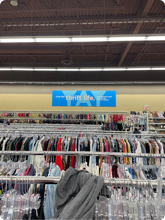
From dollar bin thrift stores to high-end consignment, I spoke to other shoppers, and learned more about what makes it all so fun (and what parts aren’t as fun)
Thriftie • Early-Stage Startup
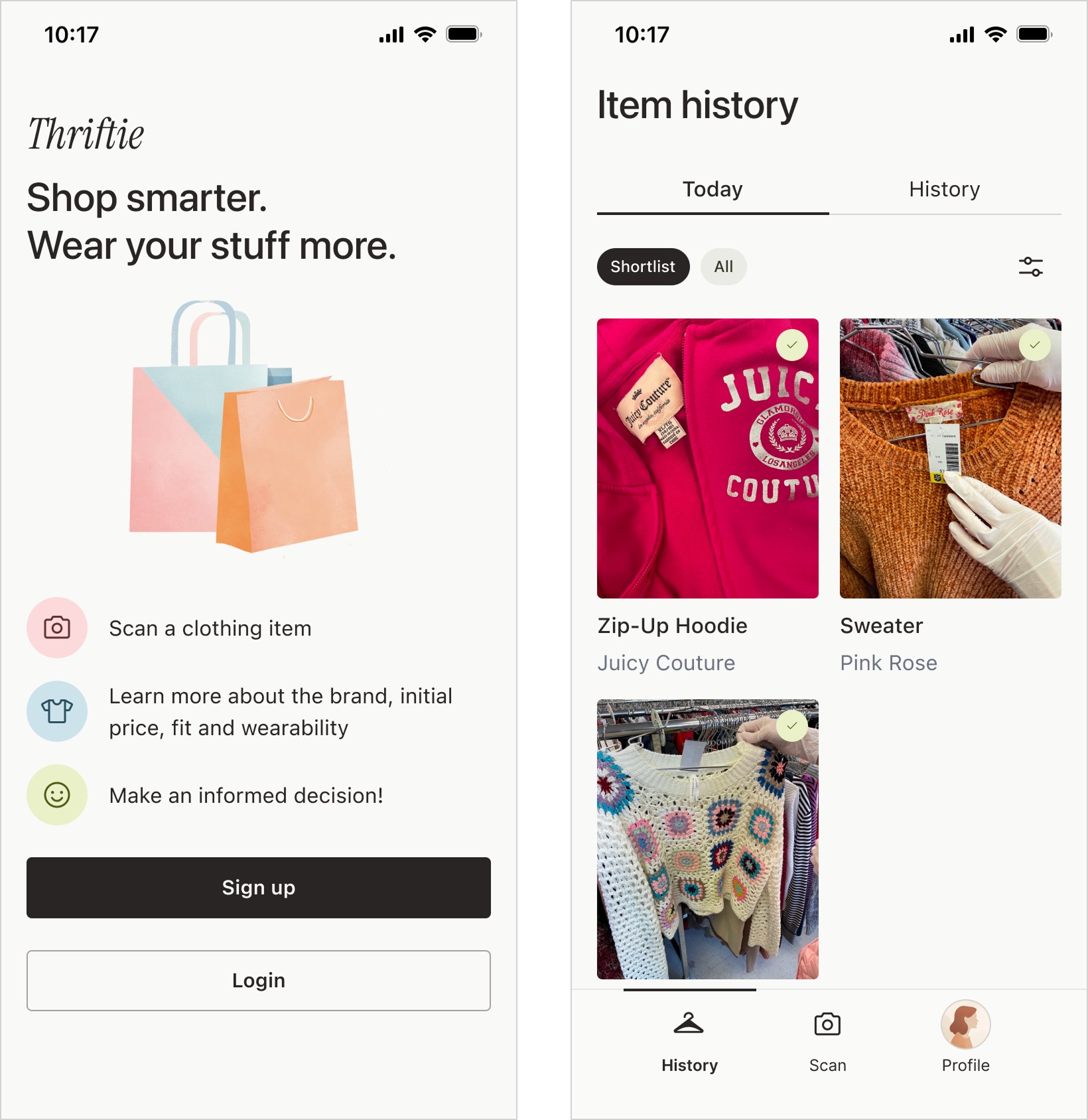
Thriftie helps shoppers make confident thrift decisions in-store using AI.
The Access Screener is a digital triage tool that helps I designed Thriftie from zero to one, shaping the product experience from early concept through validated prototype.
How does Thriftie help?
Without Thriftie, many shoppers rely on guesswork when thrifting. They struggle to assess value, recognize quality, and decide what to buy versus leave behind.
Thriftie supports decision-making in the moment by providing lightweight contextual guidance. That helps users feel confident that they’ve made a good choice without disrupting the in-store experience.
Validation & early outcomes
Although Thriftie has not yet been released, early usability testing and concept validation revealed several promising signals:
These findings helped validate the core concept and informed subsequent design iterations.
+ enjoyed a lot of thrift trips in the name of research! :)
Thrifting is a booming industry! Gen Z especially loves a good thrift find.
But because of its popularity, it’s getting harder.
Prices are rising, inventory is more competitive, and shoppers still want fast confident decisions without losing the thrill of the hunt.
The existing thrifting tools prioritize speed, fakes detection, and flip value. We wanted to focus on personal context, taste, and intentional purchases. (That you could still resell later if you wanted.)
We wanted to create a product that would help people thrift. To start, we conducted online surveys and a lot of field research.
I have been a huge thrifter for yearssssssss, so this was a dream project!
Let’s hear from the people!
From dollar bin thrift stores to high-end consignment, I spoke to other shoppers, and learned more about what makes it all so fun (and what parts aren’t as fun)
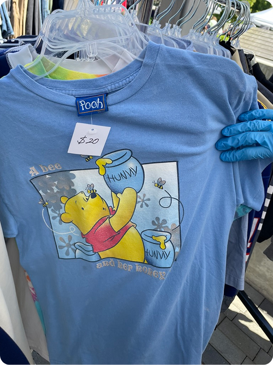
I also thrifted a lot myself to personally feel the shoppers’ joys and woes.
We heard from fellow thrifters and learned a lot:
New to thrifting
I find it kind of hard to understand if a piece is good quality or not. Sometimes I buy something and it falls apart really quick.
Vintage-curious shopper
So I like older pieces, but I don’t really know the labels of the era that well. I kinda wanna know if it’s the Aritzia or the SHEIN of the 90s, like what am I dealing with here?
Casual reseller
I have a pretty good sense of what an item will cost, but it’d be great if I could look it up right at the store.
Long-time thrifter
It used to be real-life thrifting was always a better deal than online, but lately some stores have been hiking up prices like crazy. I want to make sure I’m getting the best deal!
The main finding
Where and when?
In-store clothing thrifting
Different thrift stores, brands, and eras all have their own quirks. With limited time and attention, Thriftie focuses on helping shoppers evaluate items directly at the rack, where decisions actually happen.
What?
Real-time item insights from a single scan
Use computer vision and contextual analysis to understand the item, surface brand and quality signals, and provide light guidance through a simple mobile flow designed for in-store use.
Business model?
Freemium
Offer a limited number of monthly scanning and evaluation features for free, with the ability to purchase more and gain access to additional features. This supports trust and long-term value without relying on ads.
Make it fast and easy to decide if an item is worth buying
Surface clear visual context around quality, brand, and value
Support confident in-store decisions without disrupting the thrill of thrifting
Ideas are great. But how will they perform in the real world?

Early testing showed that some shoppers wanted a lot of detail, while others wanted a quick overview. We knew the product needed to support both.

I ran Wizard of Oz tests with a few thrifters: I Googled and shared item insights as if they were automated. Shoppers said the guidance felt helpful, especially for unfamiliar or older items.

We built a lightweight prototype to test the scanning flow in-store. It helped us confirm the core value and learn more about the constraints around speed and attention.
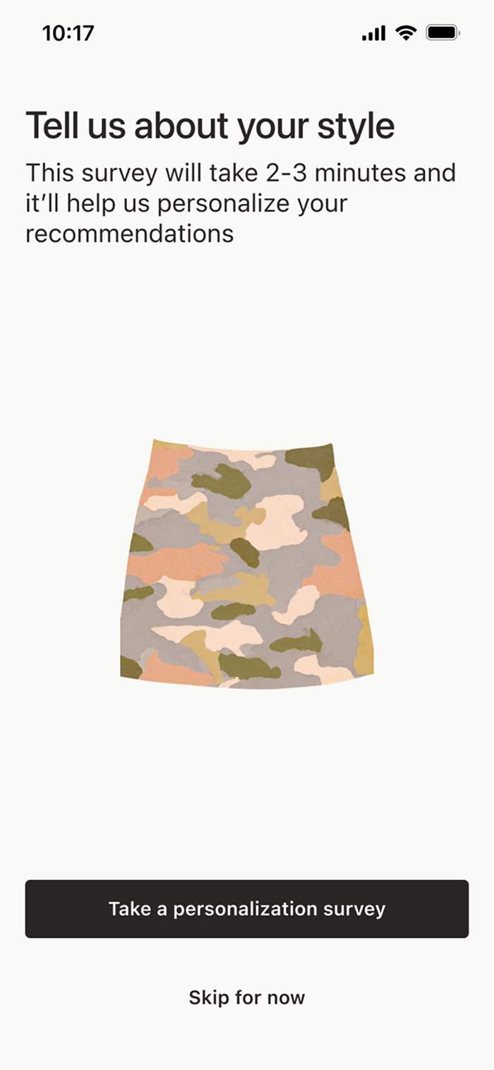
A little context goes a long way
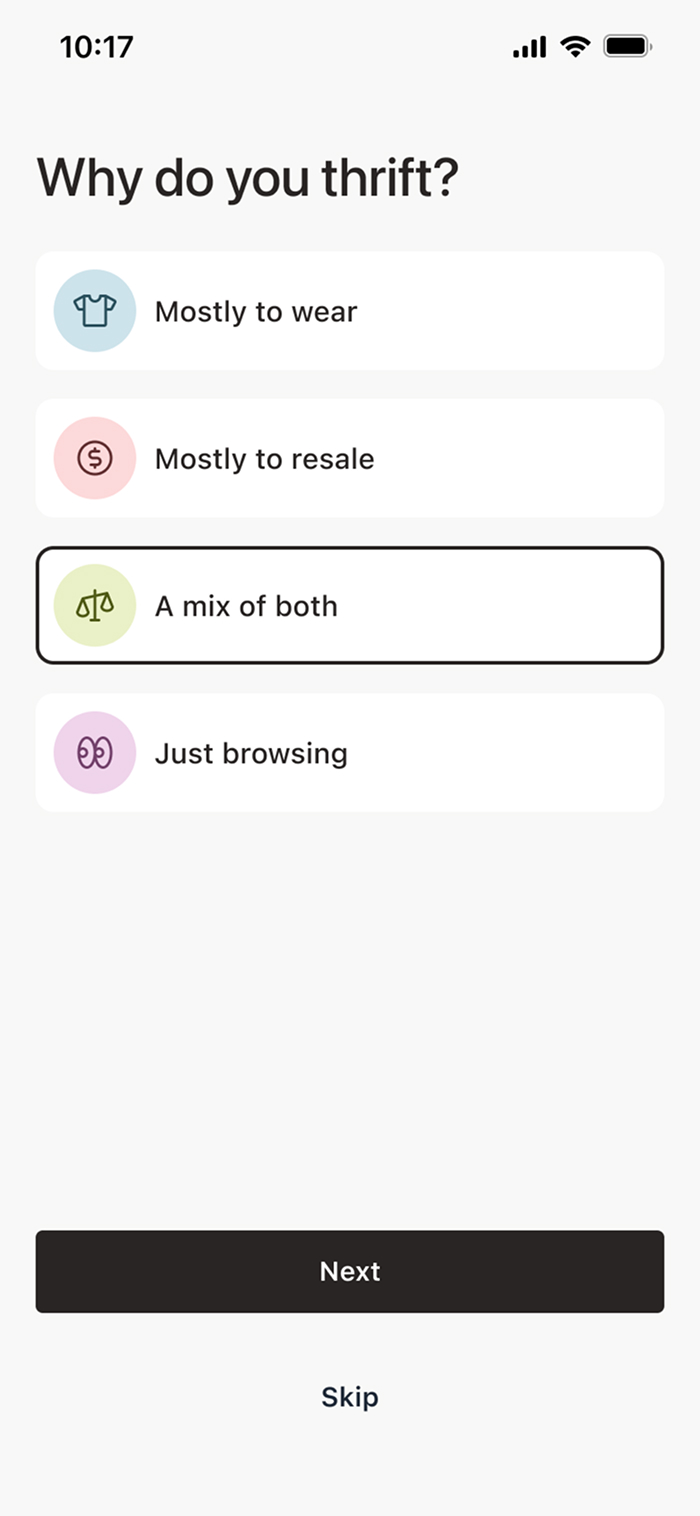
During onboarding, Thriftie invites users to complete an optional questionnaire. If they do, this information is used to personalize recommendations, especially for things like fit and sizing.
Maximum value, minimal time
I used an LLM to help design questions that were easy for users to answer and produced reliable information for the model. We avoided open-ended questions (too ambiguous). Instead I used multiple-choice responses so the model could generate more consistent and useful guidance.
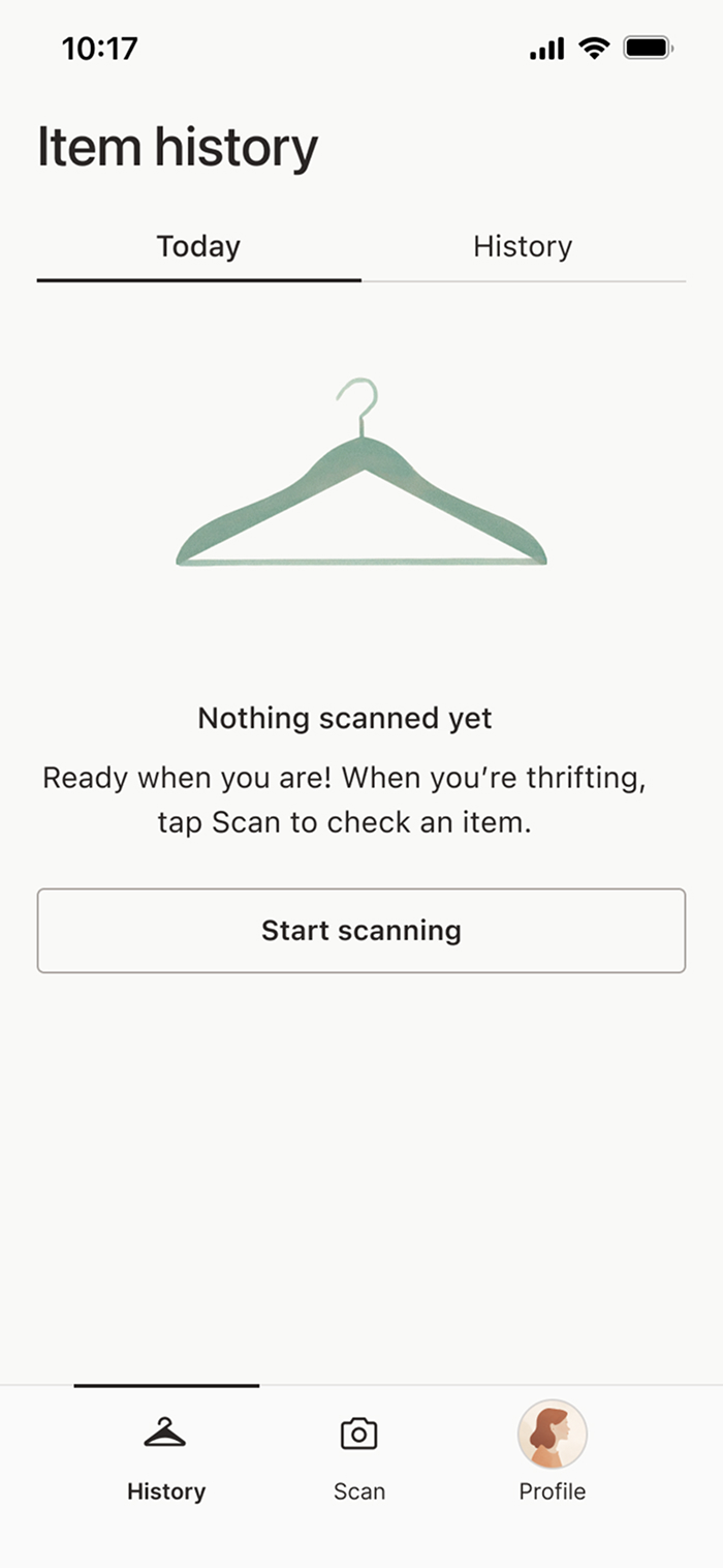
Empty states and tutorials
First-time users haven’t scanned anything yet and don’t know what matters when scanning. Clear empty states and lightweight tutorials help set expectations and guide users before their first thrift trip.
Starting point
I initially considered dropping users directly into scan mode. But most people don’t download the app while standing in a thrift store!
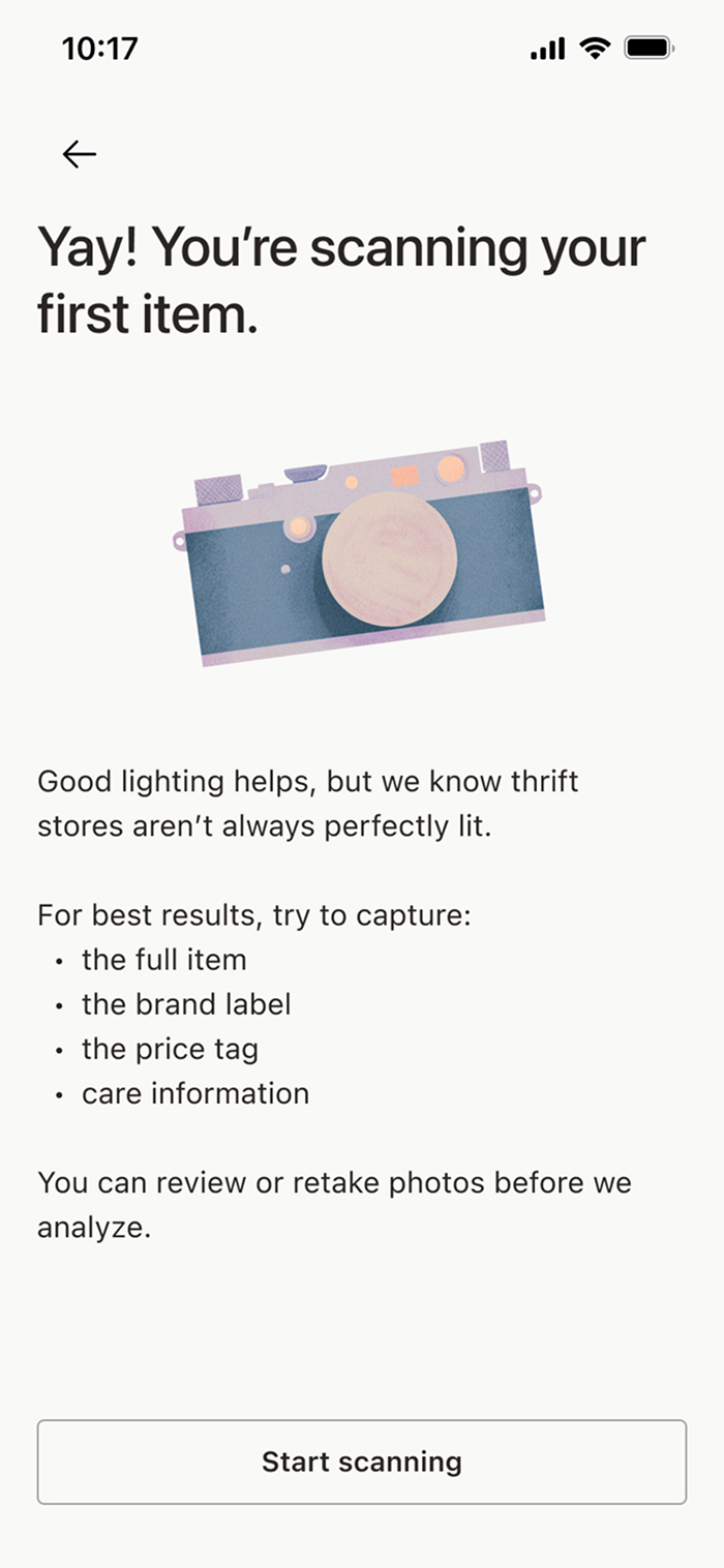
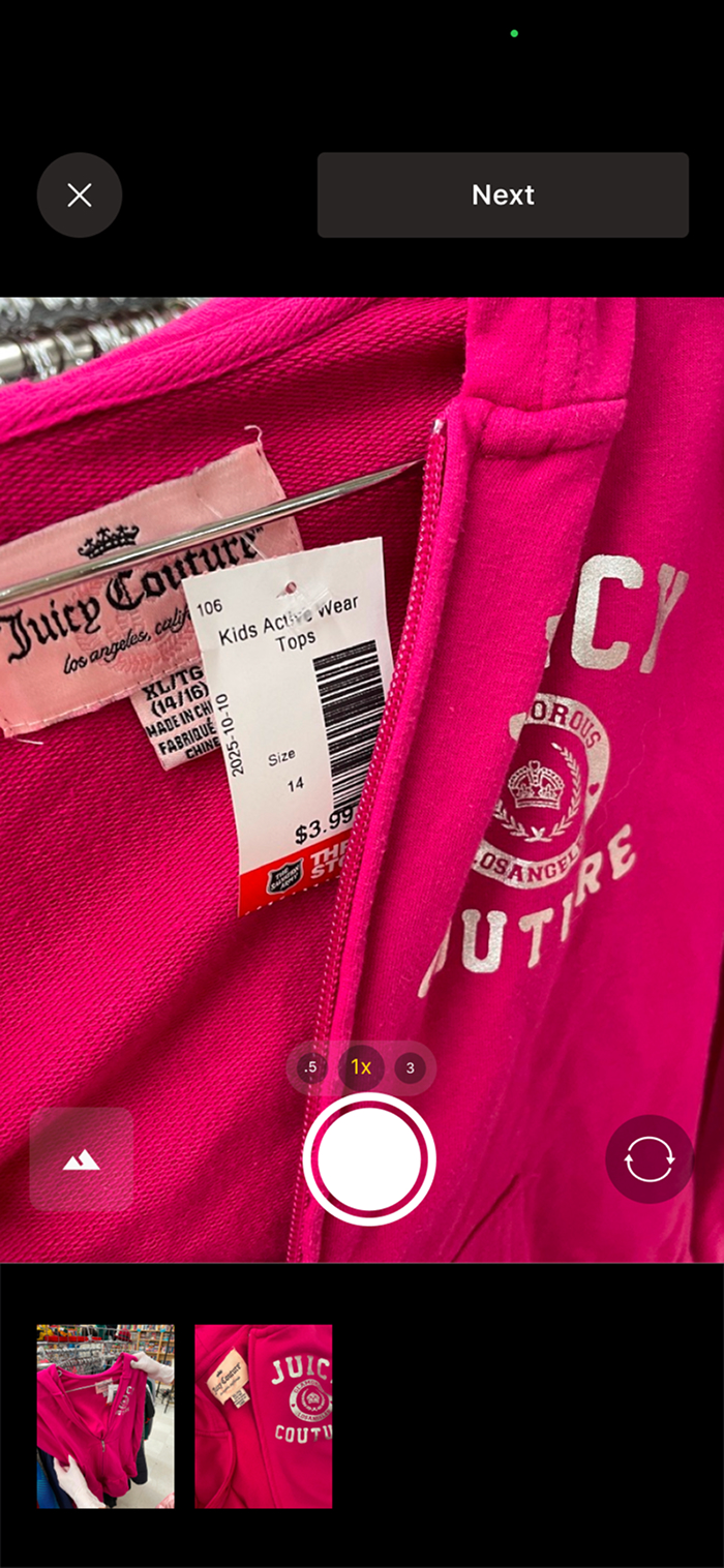
Real world thrifting
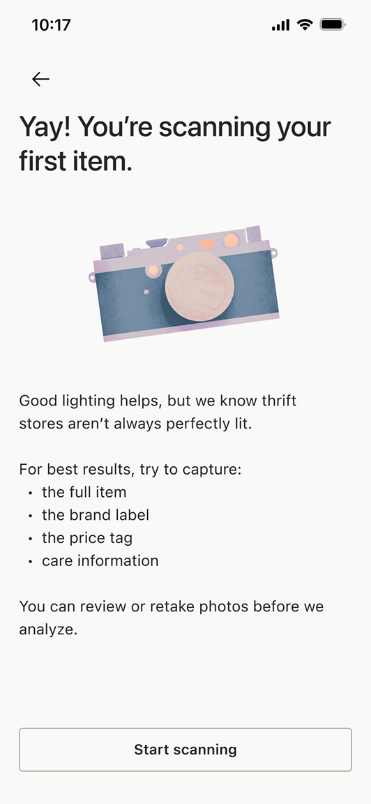
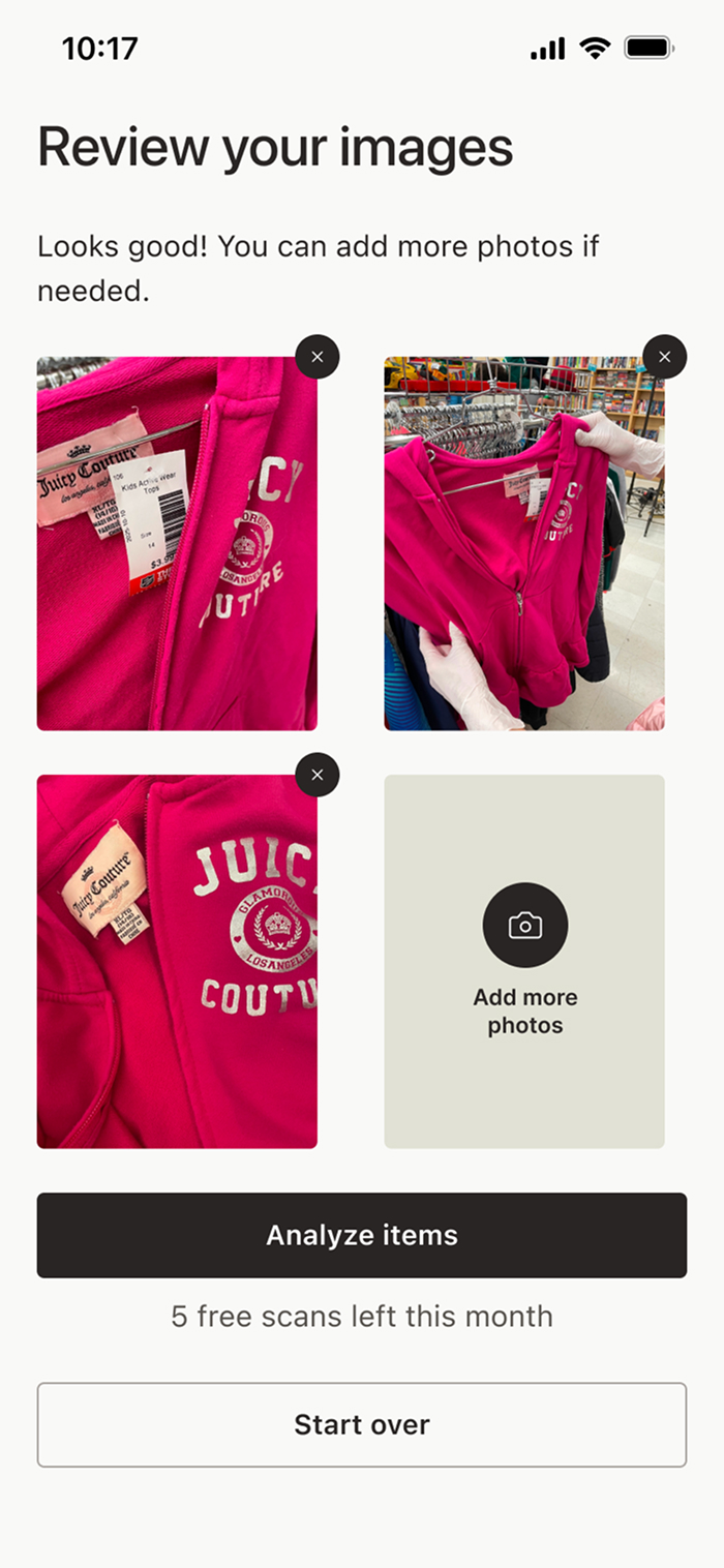
Thriftie is designed for decisions in brick-and-mortar thrift stores. The users can quickly snap a few pictures without breaking their shopping flow.
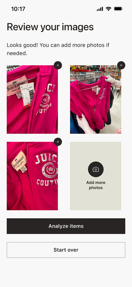
Review
I added a review step so users can check their photos before scanning and avoid wasting a scan. We also explored giving real-time photo guidance, but that would have required early image analysis. Instead, we opted for a simpler safeguard: if the photos won’t produce a reliable result, the scan is stopped and the user is told what’s missing.
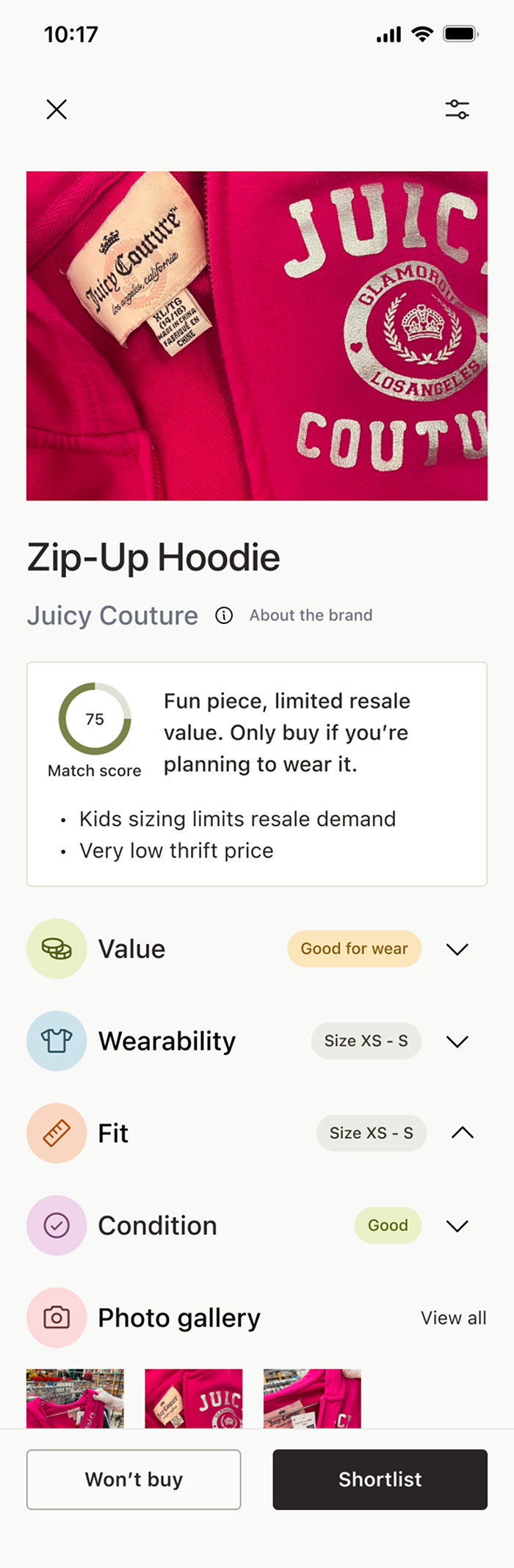
See-at-a-glance
To balance between the users who want a lot of information and users who don’t, I made the information hidden but easily accessible. The accordion labels also let the user know what the overall verdict is even before they click through.
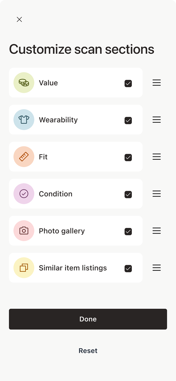
Keeping power users in mind
What if users prefer a different sorting order or don’t care about some of the categories? We created a way to reorder and pick and choose. This may not be used by every user, but the ones who need it, will appreciate the flexibility it gives them.
Scanning head to toe
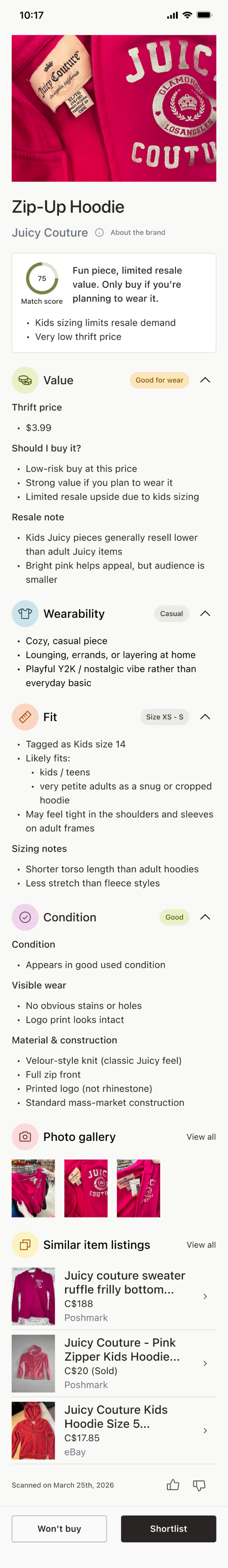
The sections are based on the learnings about what users think of when thrifting. Each accordion answers a specific question, so users can easily see what they care about most.
Skim or dive in
This approach increases vertical scrolling, but keeps each item readable and easy to scan in a busy store. Users can pick and choose what they read.
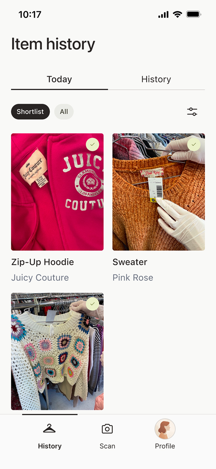
Shortlisting
The users can review their cart and compare different items from their trip without digging through their real cart or Googling brands.
Daily reset
I wanted shoppers to be able to compare items within the context of a single thrift trip. From talking to users, they preferred the scans resetting daily instead of per session, since a day still felt like one continuous trip even if they left and came back or visited multiple stores. A “session” added too much complexity to the mental model as well.
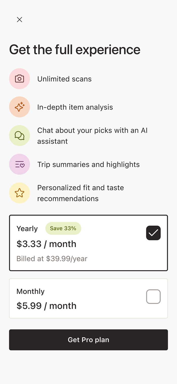
Get the full experience
This modal appears when users reach the scan limits of the free tier and introduces Thriftie Pro as the next step. It clearly lets the users know what they can unlock with a subscription.
Just enough detail
Explaining value helps builds confidence. However, giving too much detail would slow decision-making. This screen lists high-level benefits with a single clear CTA to avoid overwhelming users.
As of today, this app hasn’t been released to the public yet. However...
Helping users when they need thrift most
Users consistently described the experience as reassuring and confidence-boosting, especially when evaluating unfamiliar brands or vintage pieces.
Daily news
The app was well-understood. The daily reset model was especially well-received and preferred over session-based tracking, simplifying the mental model for thrift trips.
Expected post-launch outcomes
Introduce a wishlist & no-buy lists that help users remember what they want, what they should pass on, and why
Help users learn from past trips by surfacing patterns in what they buy, skip, or regret over time.
Add small budget and restraint tools that encourage intentional thrifting rather than impulse buys.
Only a Sith deals in absolutes
Thrifting decisions are situational. An item can be a great buy for wear and a bad one for resale, or vice versa. Also, people are all individuals with their own tastes! So guidance needs to reflect context, not a single “worth it” score.
It’s all about well-placed safeguards
Light guardrails like photo review and quality checks prevented frustration without trying to control every edge case.
Keeping AI humble
AI worked best when it supported judgment and highlighted trade-offs. Not when it tried to give definitive answers in a domain full of ambiguity! We can’t tell the user if they need this or don’t. All we can do is give them the info and support their choicemaking.
Explore other case studies using the buttons below.