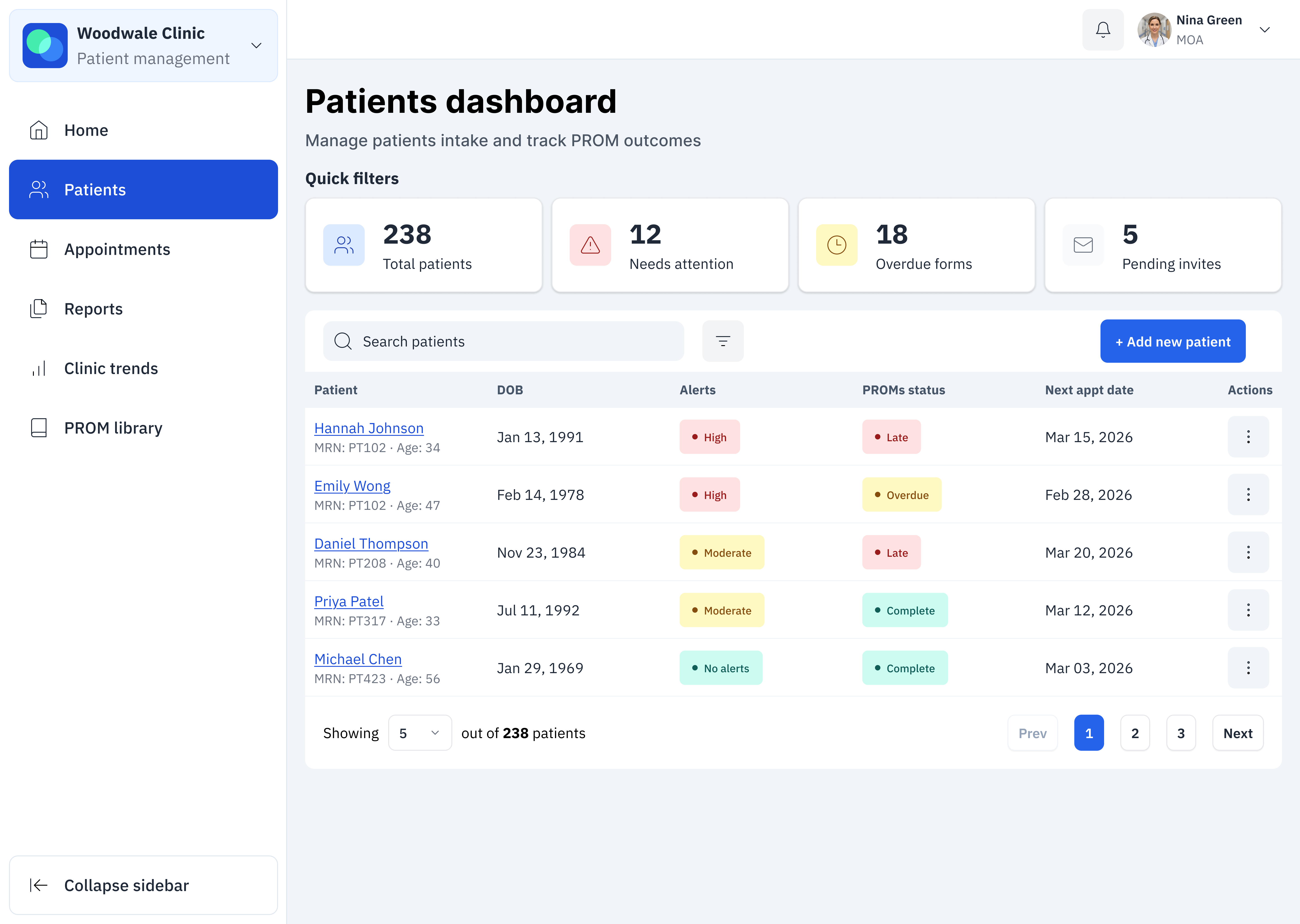
Everwell

Achieving a 98% form compliance and helping clinicians spot trends

Hero mockup for project

Animated Everwell dashboard showing a patient’s physical health trend line gradually building over six months

Project overview

At some clinics, patients with chronic conditions are asked to complete PROMs (patient-reported outcome measures). But the existing system made it difficult for clinicians to see progress over time, and the patients were overwhelmed trying to track how they were feeling.

We redesigned this into a data-driven Trends experience that makes health progress clear, approachable, and actionable for both patients and care teams. I led the visualization strategy and the patient-facing side of the experience.

As a result, completion rates increased to 98%, and clinicians can now quickly identify changes and risks.

Role
Product Designer
Team
Senior Product Designer, Product Designer, Product Manager, Developer team
Timeframe
~6 months
Platform
Provider: Web app (desktop & mobile), iOS app
Patient: Web app (desktop & mobile), iOS app

Design highlights

Starting with the fun part: the designs

Once you’ve seen the designs, scroll down to learn about all the behind-the-scenes details (or click here to go straight to it)!

Home page

Everwell provider dashboard home screen showing clinic overview with patient alerts, upcoming appointments, and summary statistics

Home page

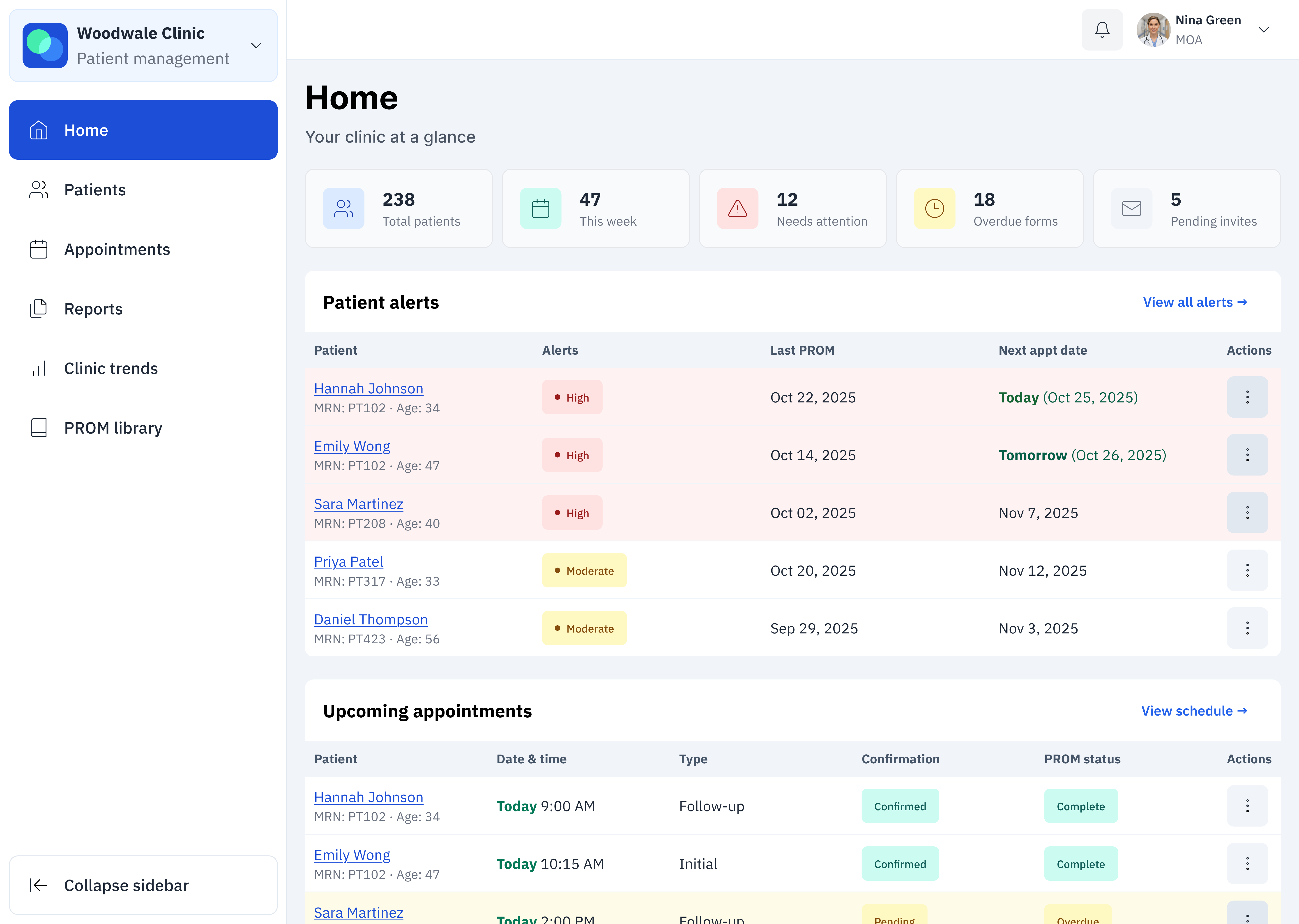
The Home page serves as the clinic’s command center, giving clinicians an at-a-glance view of what needs their attention most. The design prioritizes safety, efficiency, and clarity:

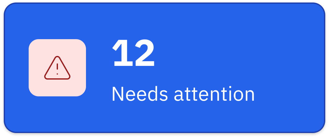
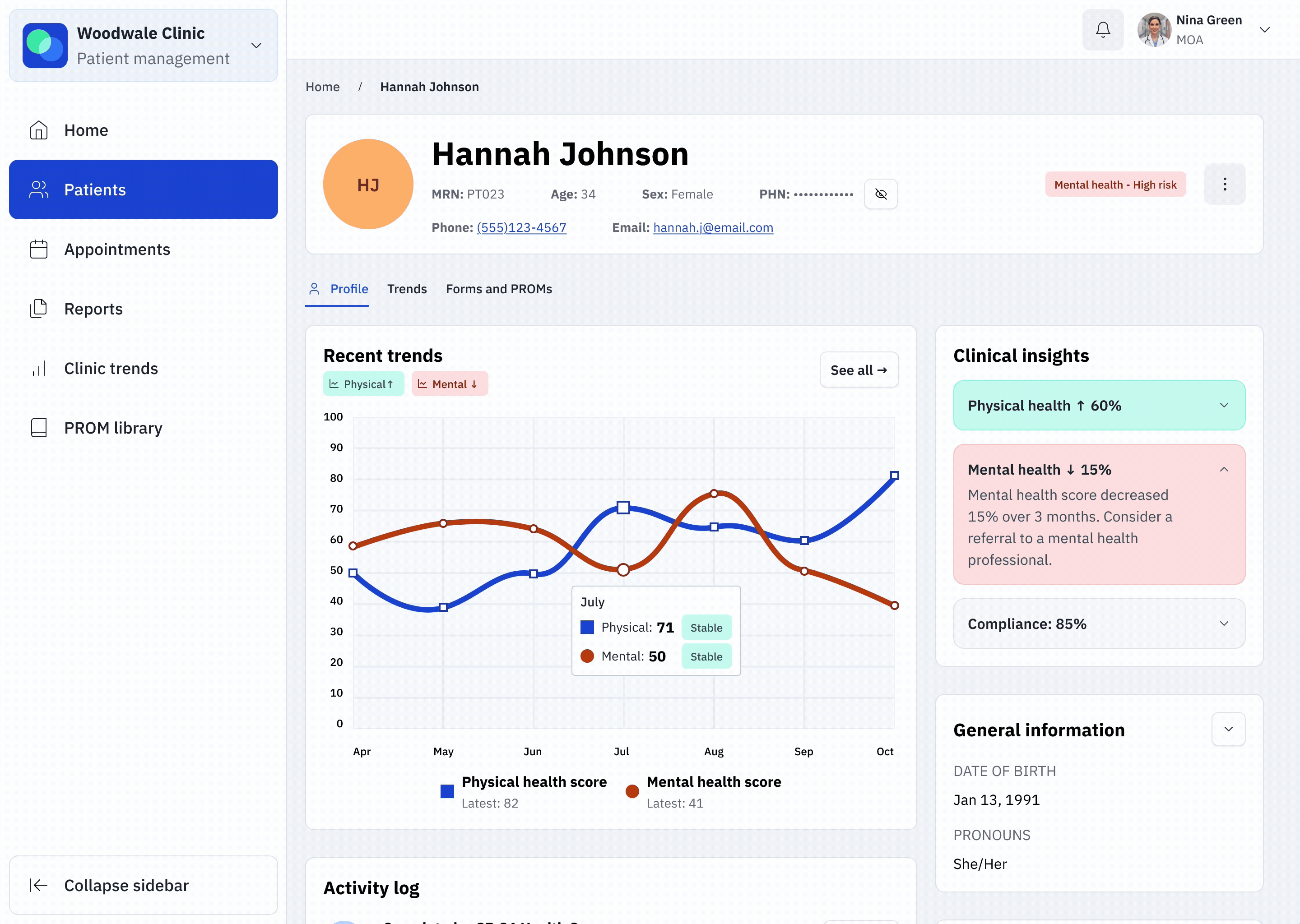
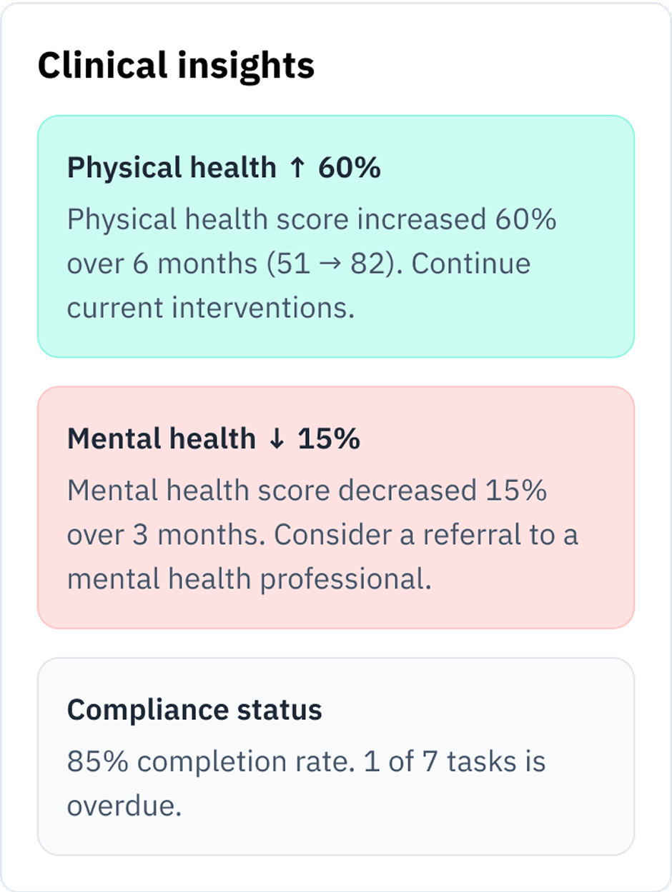
  • Patient alerts surface high-risk patients first, helping clinicians triage quickly
  • Upcoming appointments show today’s and tomorrow’s visits, with PROM status so providers know whether the patient is prepared
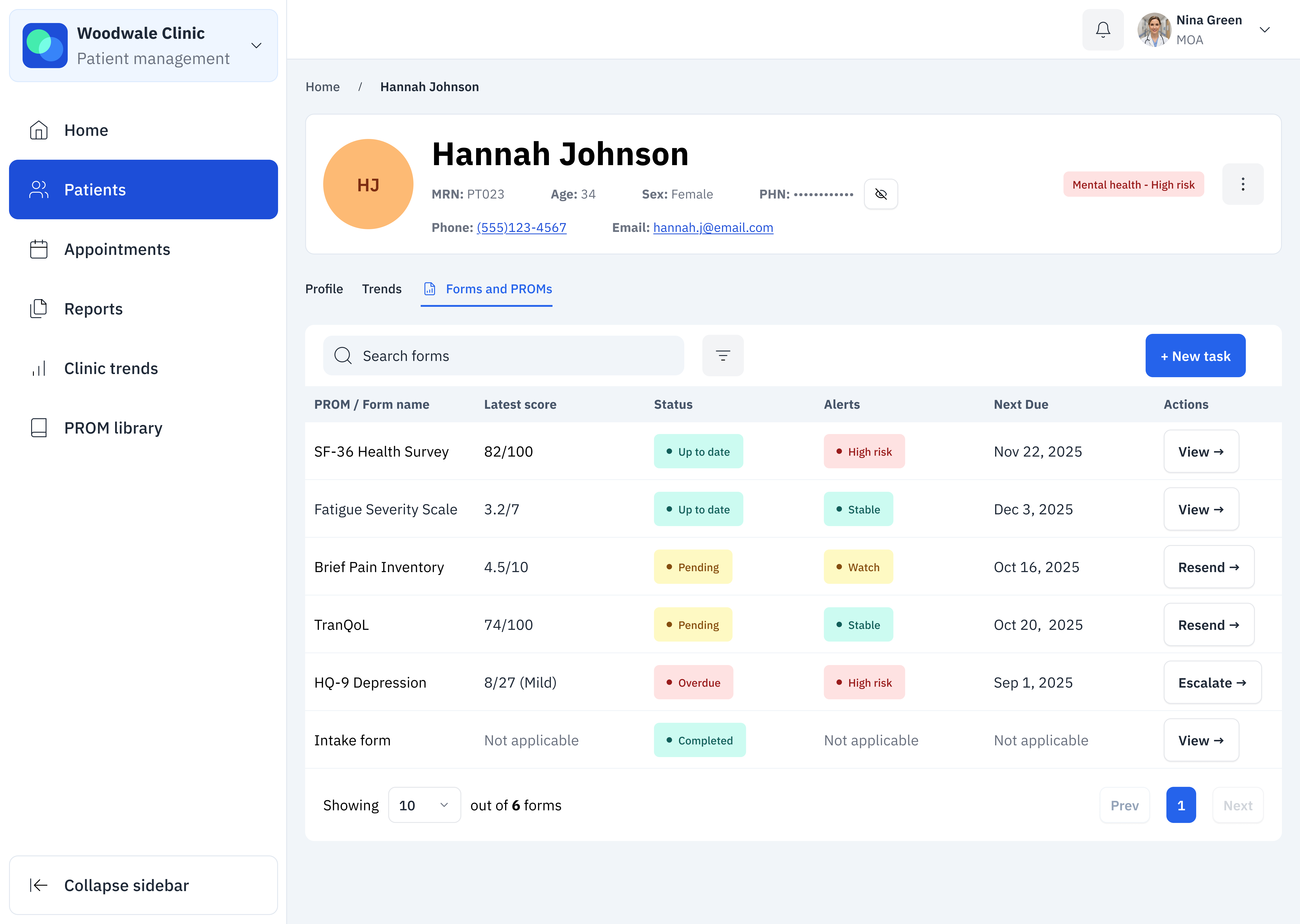
  • Pending actions centralize overdue tasks and weekly to-dos, keeping clinical and administrative staff aligned
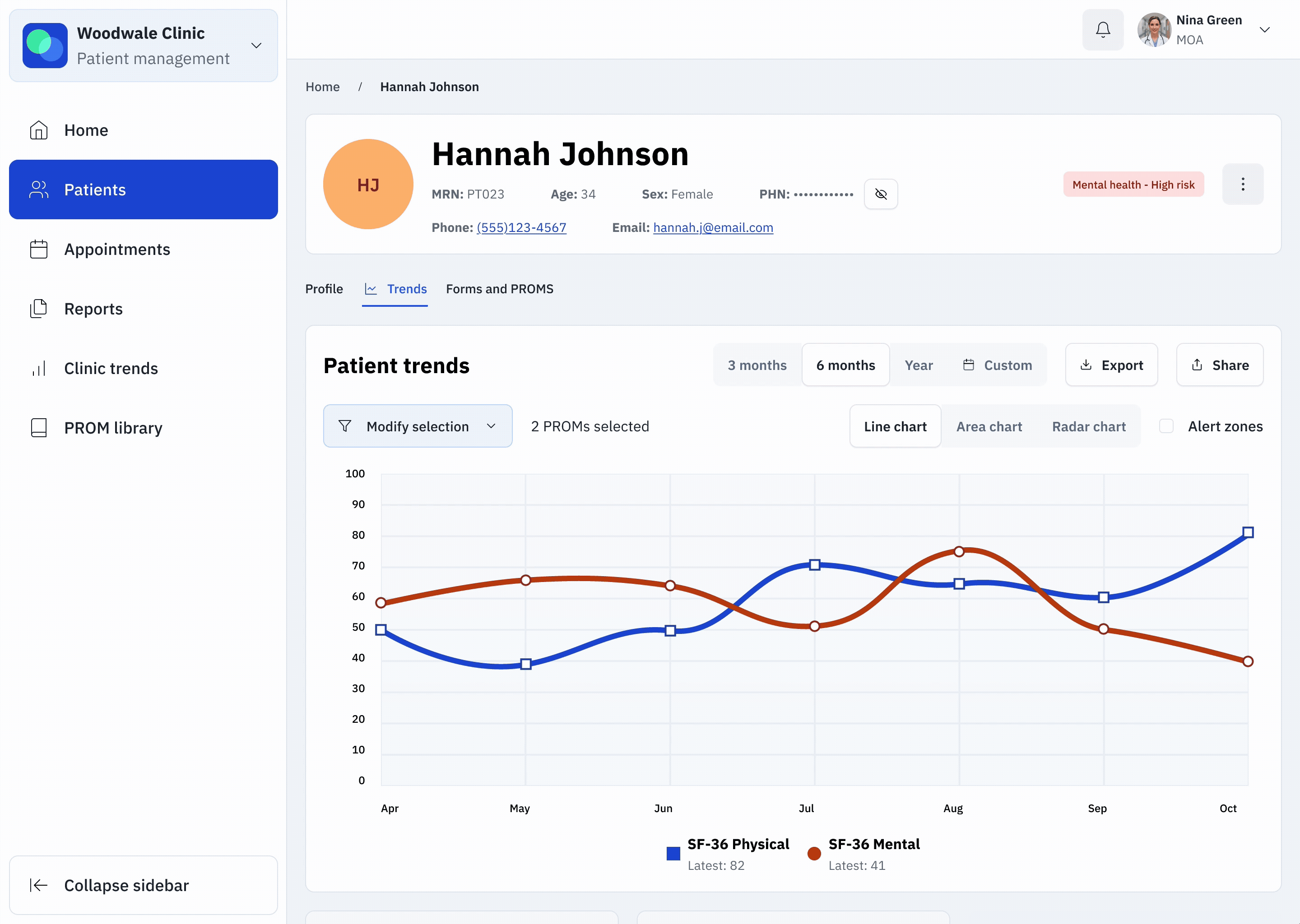
  • Clinic-wide trends provide a lightweight snapshot of population health, alert distribution, and PROM engagement, with a link to deeper analytics

This page balances urgent tasks (alerts, overdue actions) with contextual insights (trends, completion rates), ensuring clinicians can act on urgent tasks and declining patients immediately while also staying aware of broader patterns.

Patients dashboard

Everwell provider Patients dashboard displaying patient list with alerts, PROM status, and quick filters for total patients, overdue forms, and pending invites
Alert card showing 12 patient records that need attention
Quick filters

Clinicians can use quick filters to quickly narrow the patient list. Clicking a tag applies the filter, and clicking again resets it.


This lightweight interaction reduces cognitive load and makes it faster to focus on the right patients without digging through advanced filters.

Patients dashboard

The Patients dashboard is the central hub for managing individual records.

Clinicians can quickly filter, search, and scan patient details including alerts, PROM status, and upcoming appointments. Clear status chips highlight who needs attention, while quick filters and action menus streamline daily workflows.

This page shifts focus from clinic-wide insights to hands-on patient management.

Patient profile

Everwell patient profile for Hannah Johnson showing physical and mental health trend lines over six months, clinical insights, and general information
Example of a clinical insights panel in the Everwell app showing summarized health metrics and compliance information.
Clinical insights

To avoid overwhelming clinicians with too much text, I designed the insights panel as an accordion. Most sections stay collapsed by default. However, high-risk alerts automatically open so critical information is never hidden.

Patient profile

The Patient profile centralizes everything a clinician needs to review for one patient.

Trends charts visualize PROM changes over time, while clinical insights flag significant shifts and suggest follow-up actions. An activity log captures survey completions and reminders, and key demographic and program details provide context.

This page turns raw scores into actionable insights, helping clinicians make more informed decisions faster.

Patient trends

Animated view of the Everwell patient trends dashboard showing health scores changing over time on a line chart.

Patient trends

The patient trends view helps clinicians track PROM scores over time and spot meaningful changes.

Clinicians can select which PROMs to compare, switch between chart types (line, area, radar), and toggle alert zones for context. A summary below the chart highlights the latest scores, changes since the last period, and whether each domain is improving or declining.

A breakdown of subdomains provides further detail, helping clinicians quickly identify where interventions are needed.

Forms and PROMs

Everwell dashboard showing the Forms and PROMs page, where clinicians can review patient questionnaires, track completion status, and manage alerts or follow-up actions.

Forms and PROMs

This page gives clinicians a clear overview of all PROMs assigned to a patient.

Each row displays the form name, latest score, status, alerts, due date, and available actions. Color-coded chips make it easy to scan which forms are up to date, pending, overdue, or high risk. Clinicians can quickly act by sending reminders, escalating, or reviewing completed forms.

This design ensures no critical assessments are missed and keeps patient monitoring organized and actionable.

Patient experience

Everwell mobile app screen showing a patient program titled 'Living Well with Thalassemia' with a list of upcoming health surveys and educational activities.
Everwell mobile app screen showing a health survey form titled 'Health and Daily Life Survey (SF-36)' where the user rates their general health using multiple-choice options.

Patient experience

While providers see structured dashboards full of alerts, scores, and clinical insights, patients interact with a simpler, friendlier experience. The program is presented with a warm, approachable name (Living Well with Thalassemia) and tasks are framed as easy check-ins rather than medical monitoring.

Patients receive clear, bite-sized actions like completing a survey, reading a short article, or tracking symptoms. The language avoids jargon, the design uses supportive visuals, and estimated time to complete reduces survey fatigue.

This contrast ensures that while clinicians get the rigorous data they need, patients feel guided, supported, and in control of their own care journey.

Healthcare providers needed patients to fill out forms.

The narrative

Dive in to learn more about the process behind the scenes and the thinking behind the solutions.

Problem

Healthcare providers struggled with manual, repetitive tasks and a lack of actionable patient insight.

Key problems

  • Providers spend 2-3 hours per day tracking and sending questionnaires
  • No clear way to view patient progress over time which leads to missed follow-ups
  • High-risk patients could be overlooked due to scattered and incomplete data

The core design challenge: How do we help providers act on real-time patient data?

Solution

My team and I designed an adaptable digital platform that helps healthcare providers save time, reduce errors, and deliver better patient care. We transformed manual workflows into automated programs, visual dashboards, and clear alerts which allow clinicians to spot patient risks and trends at a glance.

Our flexible designs ensure that Everwell can easily support new clinical specialties and future care programs as the organization grows.

Key contributions

During this project, I:

  • Designed the Trends feature, translated complex patient data into intuitive charts and visual summaries which made health trends easy for clinicians to spot and act on.
  • Led data visualization strategy, during which I developed line and radar charts, smart tooltips, and visual summary cards for actionable insights.
  • Advocated for user-centered design, conducting interviews and usability testing with clinicians, MOAs, admin staff, and patients to keep real-world workflows and experiences at the center of every decision.
  • Streamlined onboarding for new programs, by developing design patterns that enabled quick adaptation for new clinics and care areas.
  • Drove cross-functional collaboration by working closely with design, product, engineering, and clinical teams to validate features and ensure that the project stayed on track.
Key impact

With the new PROM workflows and visualization, clinicians could spot high-risk patients and overdue forms in a glance while patients received clear and approachable tasks.

This shift directly boosted engagement, achieving a 98% patient completion rate (up from 20% with paper forms) and helping providers identify trends 60% faster.

How might we help providers easily monitor patient progress and identify at-risk individuals?

Research & discovery

I interviewed 15 clinicians, MOAs, and admin staff to map out workflow pain points. Through those interviews, I uncovered several critical workflow challenges:

Providers needed to spot at-risk patients as soon as possible, but there was no way to currently get insight into a patient’s status at a glance
Visual summaries were overwhelmingly preferred (5:1 preference) over other types of data display, such as tables of numbers
At the time, providers needed to manually sift through each patient’s PROM scores to identify any areas of concern.
Providers are extremely busy. In their day, every second counts.

Design North Stars

The user research revealed critical pain points that guided our design principles throughout the project:

Speed above all: every interface decision prioritized immediate comprehension and rapid decision-making
Visual-first information architecture: we committed to transforming raw data into intuitive visual patterns that clinicians could scan and understand instantly
Eliminate manual data search: the system needed to surface critical insights proactively rather than require providers to look for problems buried in data tables

Iterative design

We also prioritized a culture of continuous improvement. By running bi-weekly design reviews and feedback loops, we ensured our solutions were grounded in real provider needs and could quickly adapt as we learned.

Thoughtful prototyping and testing - needed to balance testing with how much of providers’ time we were allowed to take
Bi-weekly design reviews and feedback loops with the broader product team.

Project impact

Better for patients

The redesign reframed technical PROMs into approachable, supportive check-ins. Instead of “SF-36 Questionnaire,” patients now see tasks like “Health & Daily Life Survey” within programs such as Living Well with Thalassemia. Clear language, estimated completion times, and educational readings helped reduce anxiety and improved participation, leading to a 98% completion rate (up from 20% with paper forms). Plus, 72% of patients reported feeling more motivated to track their health after using the digital monitoring tool.

Better for clinicians

Clinicians gained real-time visibility into alerts, overdue tasks, and score trends without having to dig through PDFs or spreadsheets. Visualized dashboards cut the time to identify concerning trends by 60%, freeing up more time for patient care and follow-up.

Better for the business

Beyond patient and provider outcomes, the modular design allowed the platform to scale quickly across new clinics and specialties. This flexibility saved significant development time and costs, while supporjting Everwell’s expansion into new markets.

Learnings

Key learnings &
reflection

What worked well:

  • Designing with future needs in mind helped us avoid costly redesigns
  • Frequent user testing surfaced pain points before they became blockers
  • Collaboration across clinical, design, and engineering teams kept the product practical and safe

What I'd do differently:

  • Invest in stronger accessibility standards from the outset
  • Add smarter notification filtering to reduce alert fatigue
  • Bring patient feedback into the process even earlier

Most proud of:

Transforming raw healthcare data into actionable insights for clinicians and patients, and building a platform that can keep evolving to meet new clinical needs.

Thank you!

Everwell patient profile for Hannah Johnson showing physical and mental health trend lines over six months, clinical insights, and general information

Thank you for reading!

Click here to revisit the designs
or explore another case study using the buttons below.